Designing a Guest Checkout for a B2B eCommerce Experience
Designing a Guest Checkout for B2B eCommerce
After research revealed account creation as a key point of friction in the purchasing journey, I designed a streamlined guest checkout experience that reduced upfront commitment while accommodating the account requirements of a B2B platform.
The solution removed unnecessary barriers from checkout while preserving the customer information required by backend systems.
01 / THE OPPORTUNITY
The Opportunity
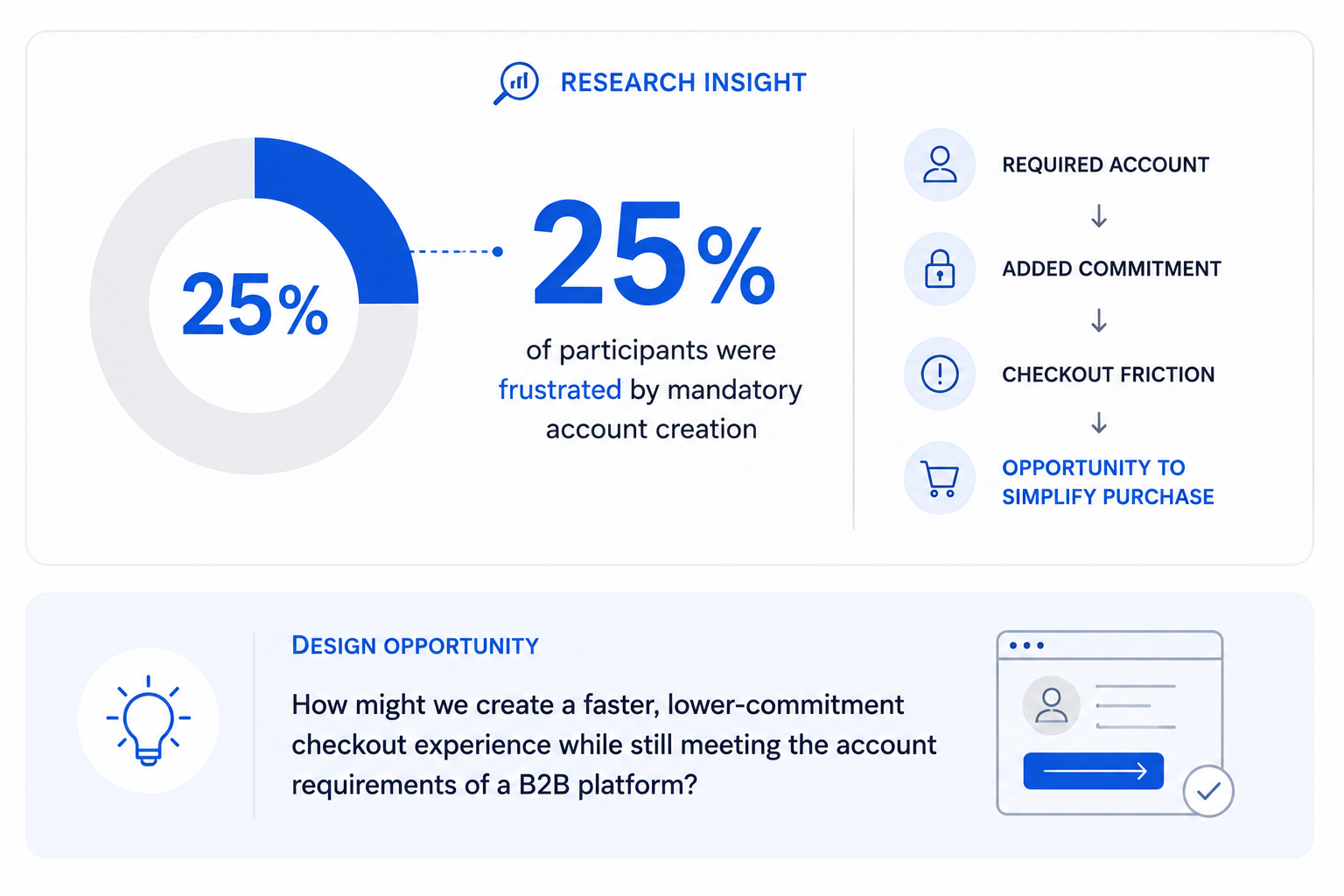
Previous customer acquisition research revealed a significant point of friction in the purchasing journey: 25% of participants expressed frustration with being required to create an account before completing a purchase.
This presented an opportunity to simplify checkout, reduce upfront commitment, and create a faster path to purchase for new customers.
02 / UNDERSTANDING THE CONSTRAINT
Understanding the Constraint
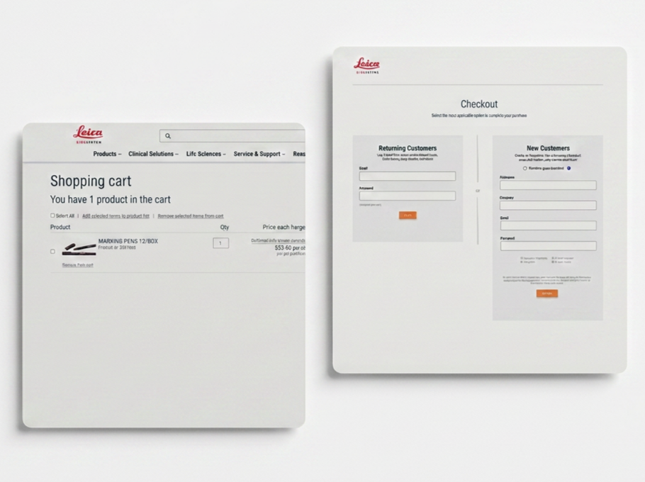
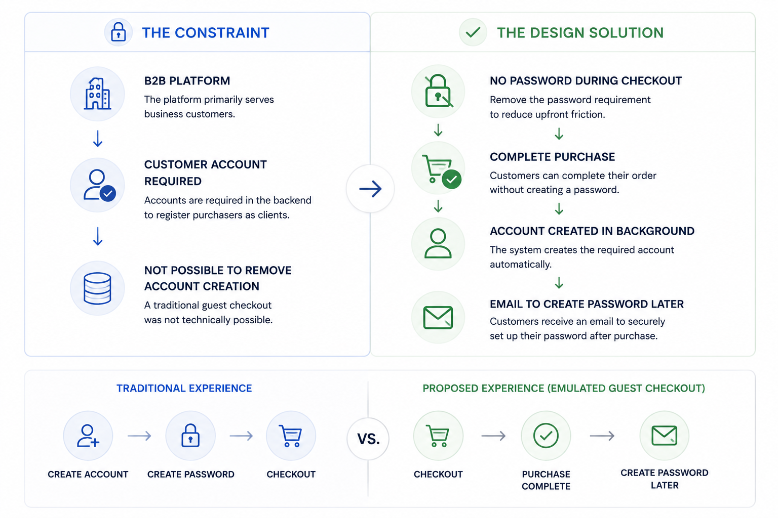
A traditional guest checkout wasn’t technically possible. Because the platform primarily served B2B customers, customer accounts were required in the backend to register purchasers as clients.
Instead of removing account creation entirely, I explored how we could make the process feel like guest checkout to the customer while still satisfying the system’s account requirements.
THE DESIGN CHALLENGE
Remove the friction of account creation without removing the account itself.
03 / DEFINING THE USER
Defining the User
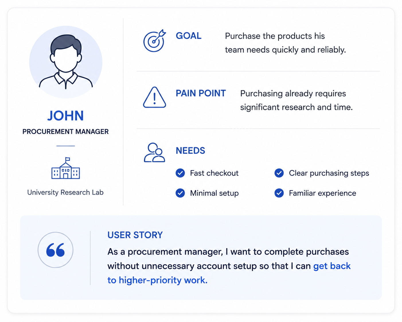
Research and empathy exercises helped define our primary user: a busy procurement professional responsible for sourcing and purchasing products on behalf of their organization.
For these customers, purchasing is a task to complete—not an experience they want to spend unnecessary time navigating. The checkout process needed to be fast, familiar, and require as little upfront effort as possible.
PRIMARY NEED
Complete necessary purchases efficiently without creating additional administrative work.
04 / MAPPING THE EXPERIENCE
Mapping the Experience
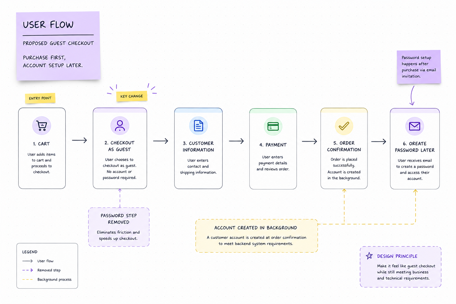
With the user needs and technical constraints defined, I mapped the proposed checkout flow to determine where account creation could be removed from the customer's immediate purchasing journey.
The new flow prioritized completing the purchase first, while moving password creation to a post-purchase step, allowing the experience to feel like guest checkout without disrupting the platform's backend requirements.
CORE EXPERIENCE PRINCIPLE
Purchase first. Account setup later.
05 / EXPLORING THE SOLUTION
Exploring the Solution
With the core user flow established, I began exploring how the guest checkout experience could work at the interface level.
Early sketches focused on simplifying the path to purchase, reducing unnecessary account-related decisions, and keeping the checkout experience familiar to users while accommodating the platform's B2B requirements.
DESIGN PRIORITIES
01 Reduce steps before purchase
02 Remove password creation from checkout
03 Keep the experience familiar
04 Clearly communicate what happens next
06 / FROM SKETCHES TO STRUCTURE
From Sketches to Structure
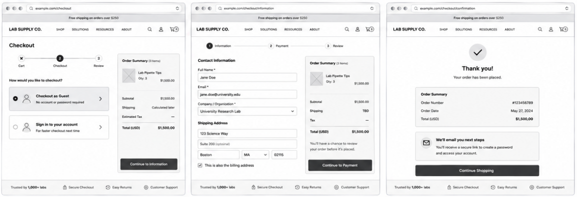
I translated the early concepts into wireframes to define the structure, hierarchy, and interaction patterns of the new checkout experience.
At this stage, I focused on keeping the purchasing journey straightforward while ensuring the information required by the B2B platform could still be collected without introducing unnecessary account-creation friction.
KEY DESIGN DECISIONS
01 — Prioritize checkout
Keep the user's attention on completing their purchase.
02 — Minimize account friction
Remove password creation from the active checkout journey.
03 — Simplify information entry
Create a clear hierarchy for the information needed to process the order.
04 — Set expectations
Clearly communicate what happens after the purchase is complete.
07 / DESIGNING THE GUEST EXPERIENCE
Designing the Guest Experience
With the structure established, I translated the wireframes into a polished checkout experience focused on making the guest path feel simple, familiar, and low commitment.
Rather than introducing a completely new checkout pattern, the final design reduced friction within an experience customers already understood—allowing them to complete their purchase without creating a password upfront.
FINAL PRINCIPLES
Guest checkout is clearly prioritized
Account set up stays out of the purchase path
Required B2B information is organized clearly
Post-purchase messaging explains what happens next
ROLE
UX Design Lead
DURATION
1 month
TOOLS
Figma, Miro, Drupal
<insert drawn sketches>