
Mega Menu Redesign
ROLE
Lead UX Designer & Researcher
FOCUS
Navigation, Information Architecture, Interaction Design
METHODS
Heuristic Evaluation, Competitive Research, Usability Testing
DELIVERABLES
Research, Mockups, Prototype, Implemented Experience
TOOLS
AdobeXD, Google Docs
Redesigning the Mega Menu
Making a large product catalog easier to scan, navigate, and explore.
The existing mega menu provided access to a large catalog of products and resources, but its structure and interaction patterns made navigating that information more difficult than necessary.
I evaluated the existing experience, researched established mega-menu usability patterns, and redesigned the navigation around clearer grouping, faster scanning, and more predictable interactions.
The solution progressed from research and heuristic evaluation through mockups, prototyping, and implementation.
01 / THE CHALLENGE
The Challenge
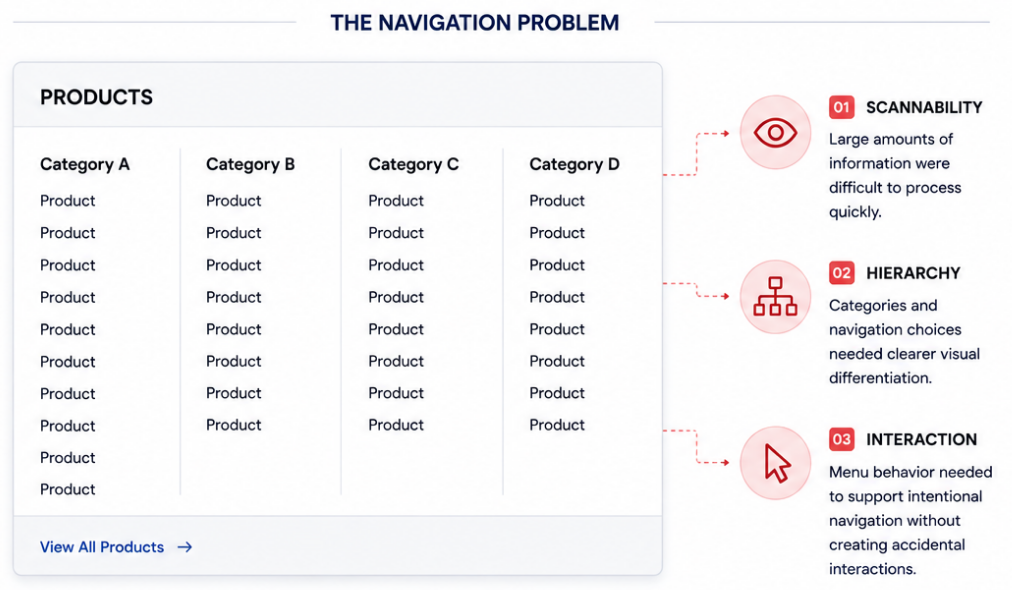
The existing mega menu needed to support a large number of products and navigation options, but the experience made it difficult for users to quickly scan, understand, and move between categories.
The challenge wasn't simply fitting more links into the menu, it was creating a navigation system that could present a large amount of information without overwhelming the user.
THE UX QUESTION
How might we make a complex product catalog easier to scan, understand, and navigate?
02 / EVALUATING THE EXISTING NAVIGATION
Evaluating the Existing Navigation
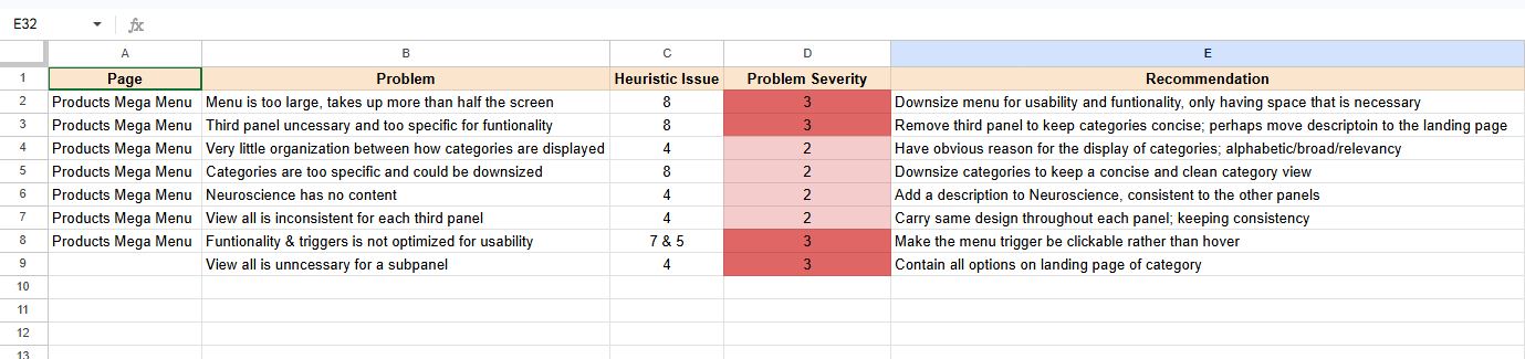
Before redesigning the mega menu, I conducted a heuristic evaluation of the existing navigation and researched established mega-menu usability patterns.
I compared the current experience against best practices for information hierarchy, scanability, menu structure, and interaction behavior to identify opportunities for improvement.
The research reinforced a key principle: a successful mega menu shouldn't simply display more options, it should make a large amount of information easier to understand at a glance.
RESEARCH FOCUS
Structure · Hierarchy · Scanability · Interaction
03 / DEFINING THE INTERACTION STRATEGY
Defining the Interaction Strategy
A successful mega menu depends on more than information architecture. Its interaction behavior needs to feel responsive without reacting to every accidental movement of the cursor.
Based on my research, I defined interaction guidelines for how the menu should open, remain visible, and close, balancing responsiveness with enough tolerance to recognize user intent.
I also explored cone prediction, allowing pointer movement toward submenu content to be interpreted as intentional rather than immediately triggering another navigation state.
INTERACTION GOAL
Respond quickly to intentional actions without reacting to accidental movement.
04 / DESIGNING THE MEGA MENU
Designing the Mega Menu
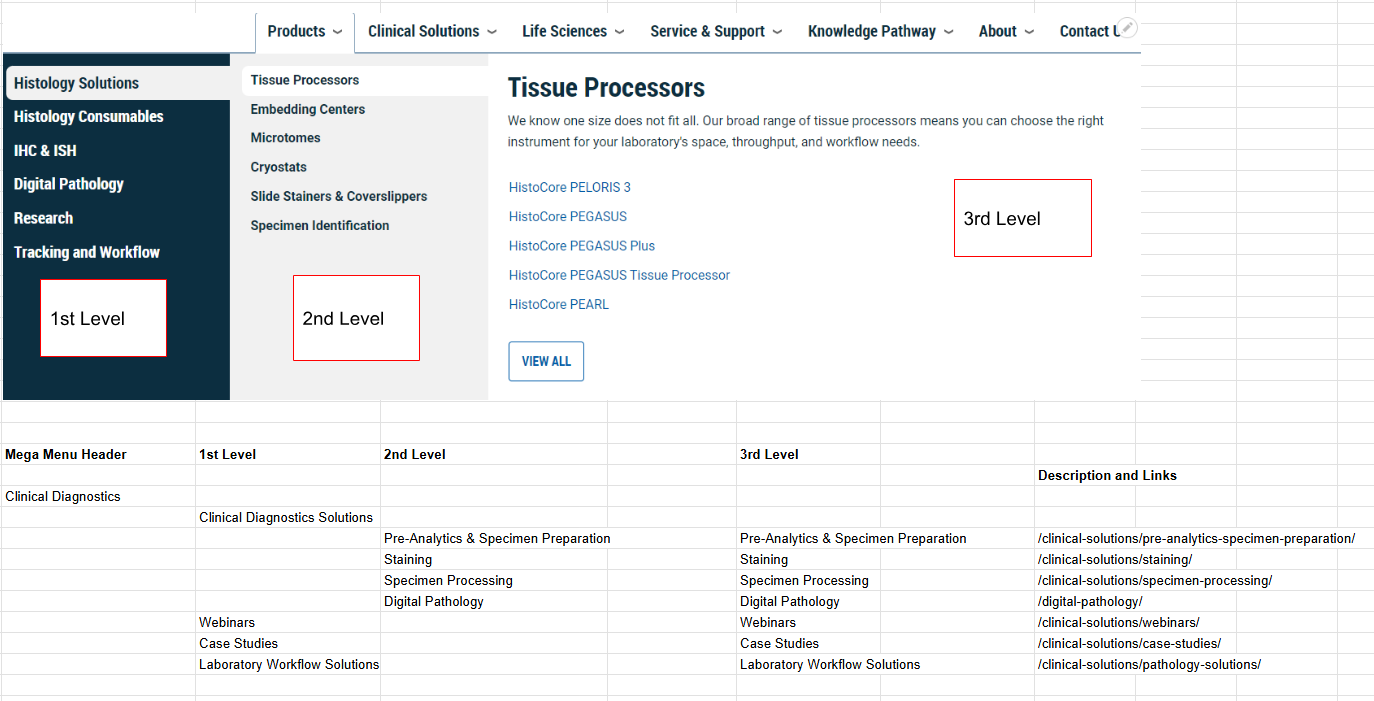
I translated the findings from the heuristic evaluation and best-practice research into a redesigned mega menu focused on making a large product catalog easier to scan, understand, and navigate.
The redesign introduced clearer content groupings, stronger visual hierarchy, and more intentional spacing to help users quickly distinguish between categories and individual navigation options.
I paired these structural improvements with defined interaction behavior, ensuring the menu was not only easier to understand visually, but also more predictable to use.
DESIGN PRINCIPLE
Make complexity feel simple through structure, hierarchy, and predictable behavior.
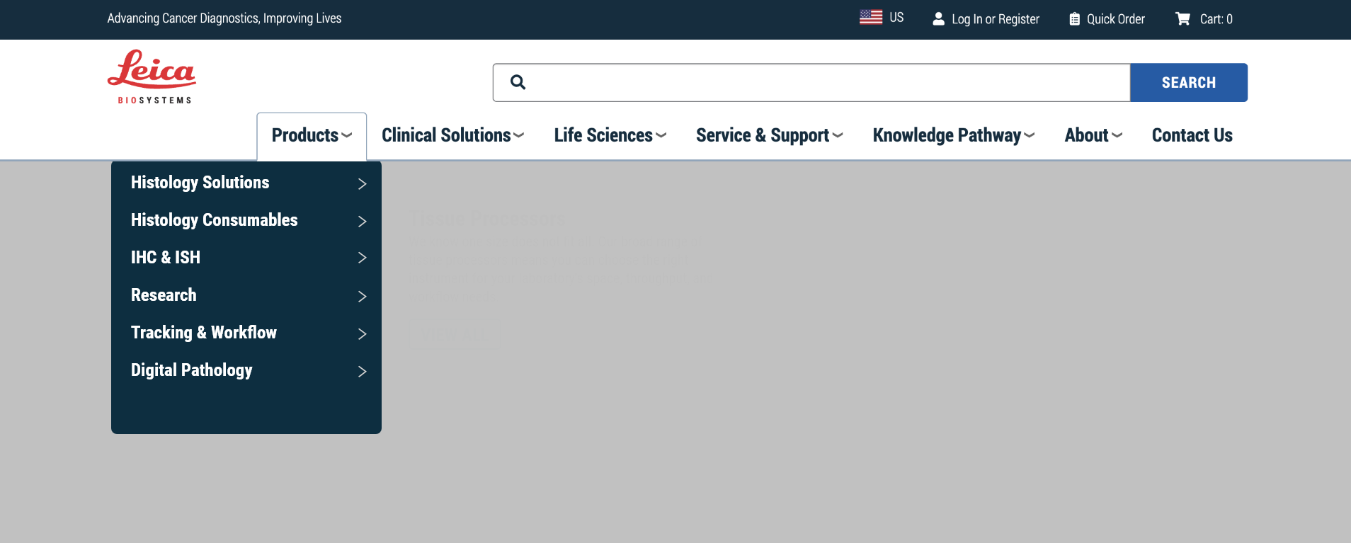
BEFORE
06 / FROM PROTOTYPE TO IMPLEMENTATION
From Prototype to Implementation
After defining the new structure and interaction behavior, I developed the redesign into detailed mockups and an interactive prototype to demonstrate how the mega menu should look and behave.
The prototype helped communicate both the visual design and interaction requirements, including navigation states and hover behavior, before the solution moved into implementation.
The redesigned mega menu was ultimately implemented, bringing the research-backed improvements into the live eCommerce experience.
FINAL OUTCOME
Research → Design → Prototype → Implementation
The Takeaway
The project transformed a difficult-to-navigate product menu into a more structured and intentional navigation experience.
By combining heuristic evaluation, usability research, information hierarchy, and interaction design, I created a solution that made a large product catalog easier to scan and navigate—and carried that solution from research through implementation.
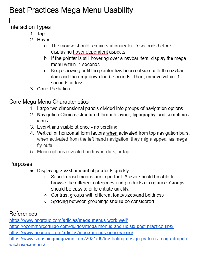
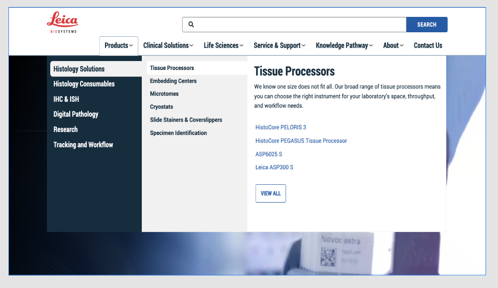
AFTER